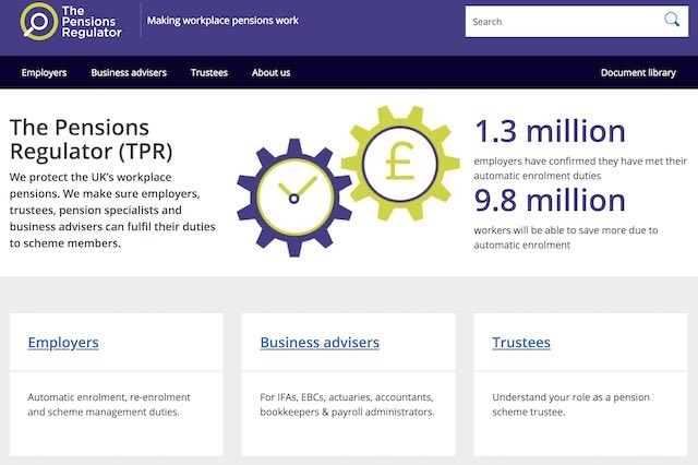
The Pensions Regulator has unveiled a new look website to give more than 3m yearly visitors a better experience on mobiles and tablets.
The new site is a key part of TPR’s redesigned branding which highlights how the organisation is changing its approach to become “clearer, quicker and tougher,” it says.
The TPR says the site rebuild should mean a “clearer and simpler experience” and help cope with a huge increase in traffic following auto enrolment and the Pensions Freedoms.
Liz Hickey, director of communications at TPR, said: “Our new website delivers major improvements to the hundreds of thousands of people who visit it every month, from employers and trustees to pension savers.
“Not only is it a better user experience, but the platform on which the website sits has been rebuilt from the bottom up to be more stable and flexible so that the content we provide is easier to update and improve.
“We are a very different organisation from five years ago; we are embedding a new regulatory culture and it is important that our stakeholders and those we regulate are aware of how we are changing.”
The new look also brings the design up to date with government digital standards and provides a more consistent experience with the .gov websites.
TPR says the introduction of automatic enrolment has driven a significant increase in visitors to TPR’s website .
In 2007/8, 149,604 people made one million visits and looked at over 2m pages. In 2017/18, 3.4m people made 6.1m visits and looked at over 39m pages on the website.
The site is used by employers, trustees, administrators, adviser, savers and the wider public.

